
proPilot 5.6.0 is here, welcome to an even more powerful experience!
Let's explore together the new features that will allow you to reconnect strategy with achievements!

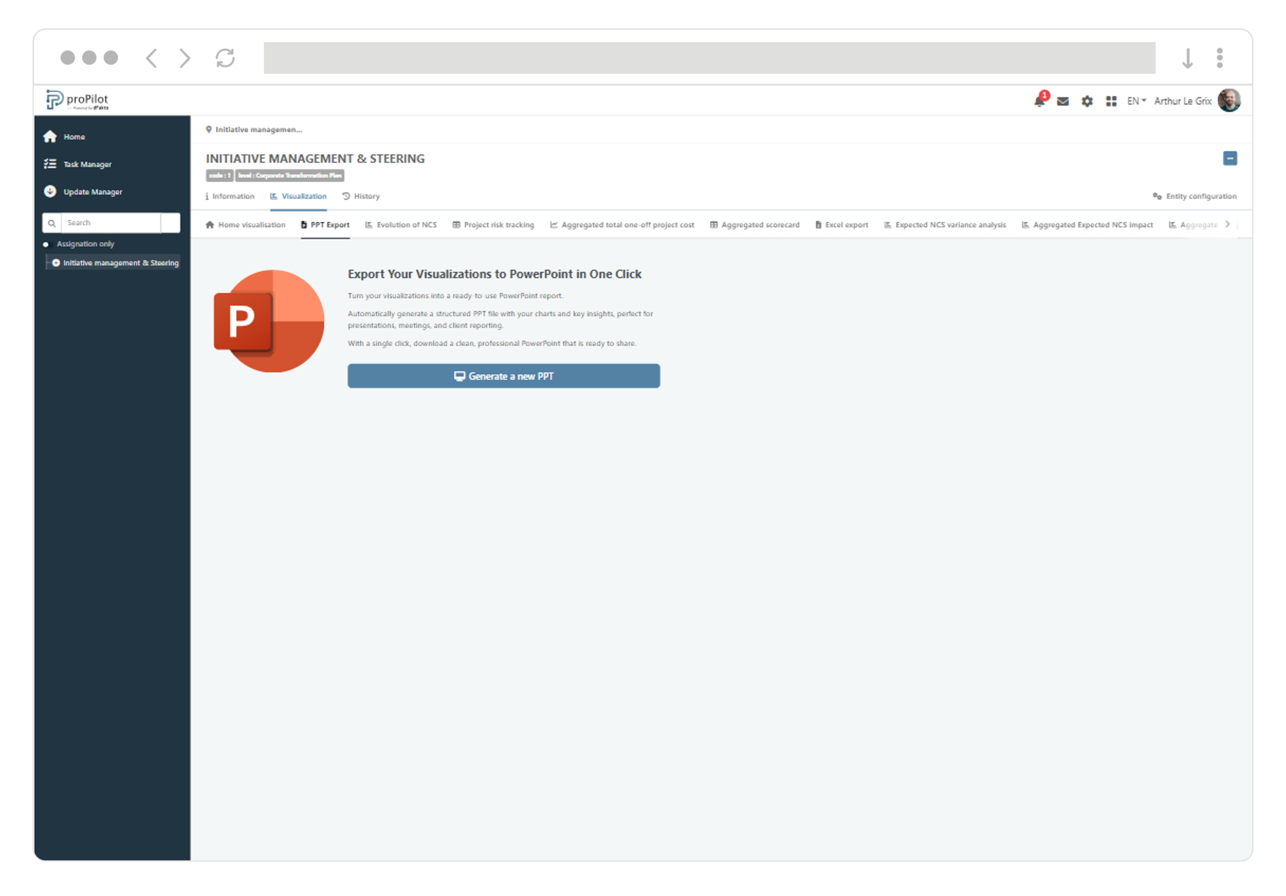
PowerPoint export: turn your visualizations into a report ready for steering committees
With the new PowerPoint export feature, users can generate a configurable visualization report in just a few clicks, ready to be presented in steering reviews or shared with stakeholders.
-
Save time with a report that is automatically dated and structured from the visualizations selected on the “Visualization” home page.
-
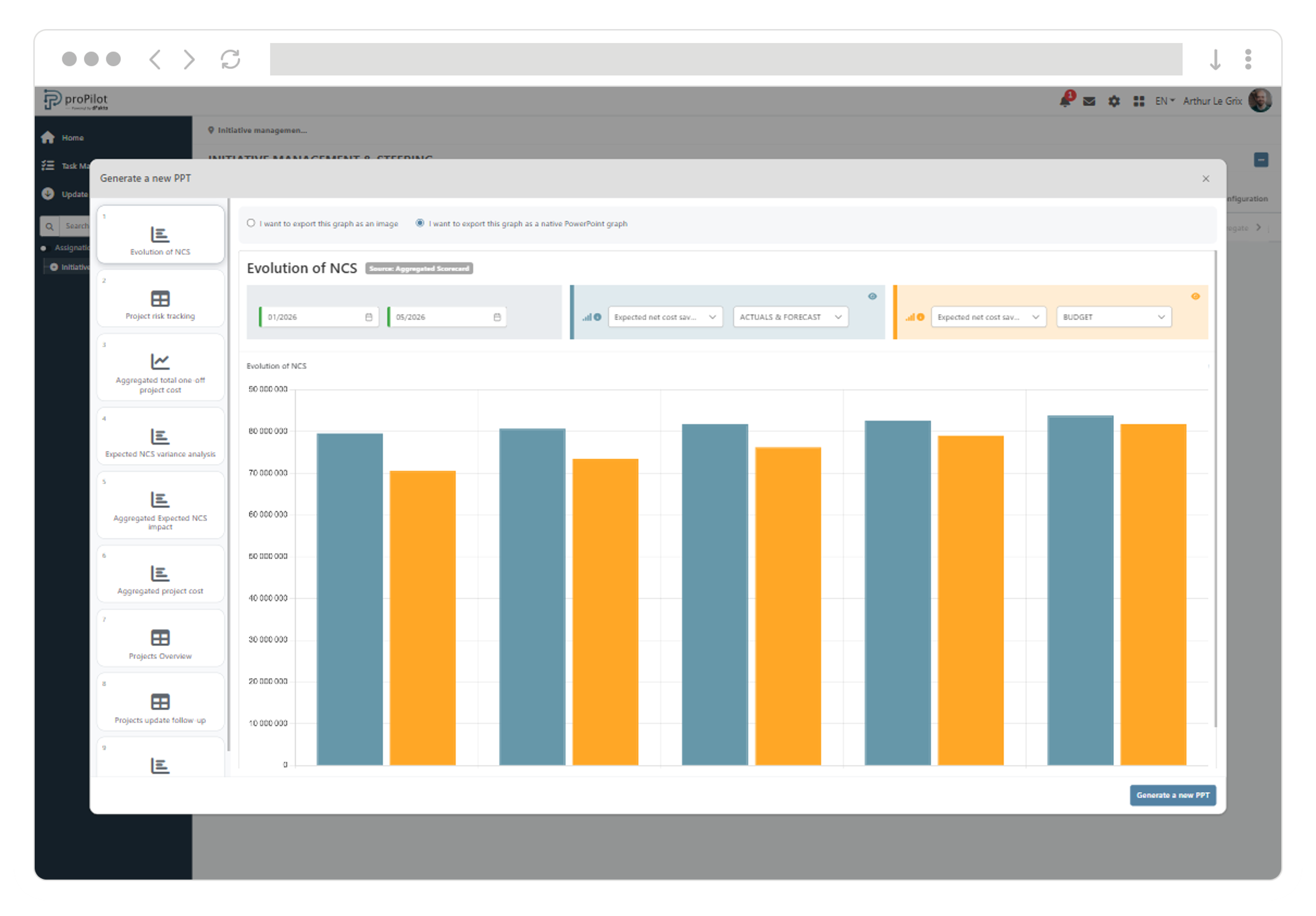
Adapt the deliverable by choosing, for each visualization, either an image output or a native PowerPoint output (editable chart with embedded data).
-
Customize content before generating by adjusting filters (indicator, data type) and including the most relevant charts and information tables.
-
Benefit from a report that follows your organization’s colors configured in the platform.
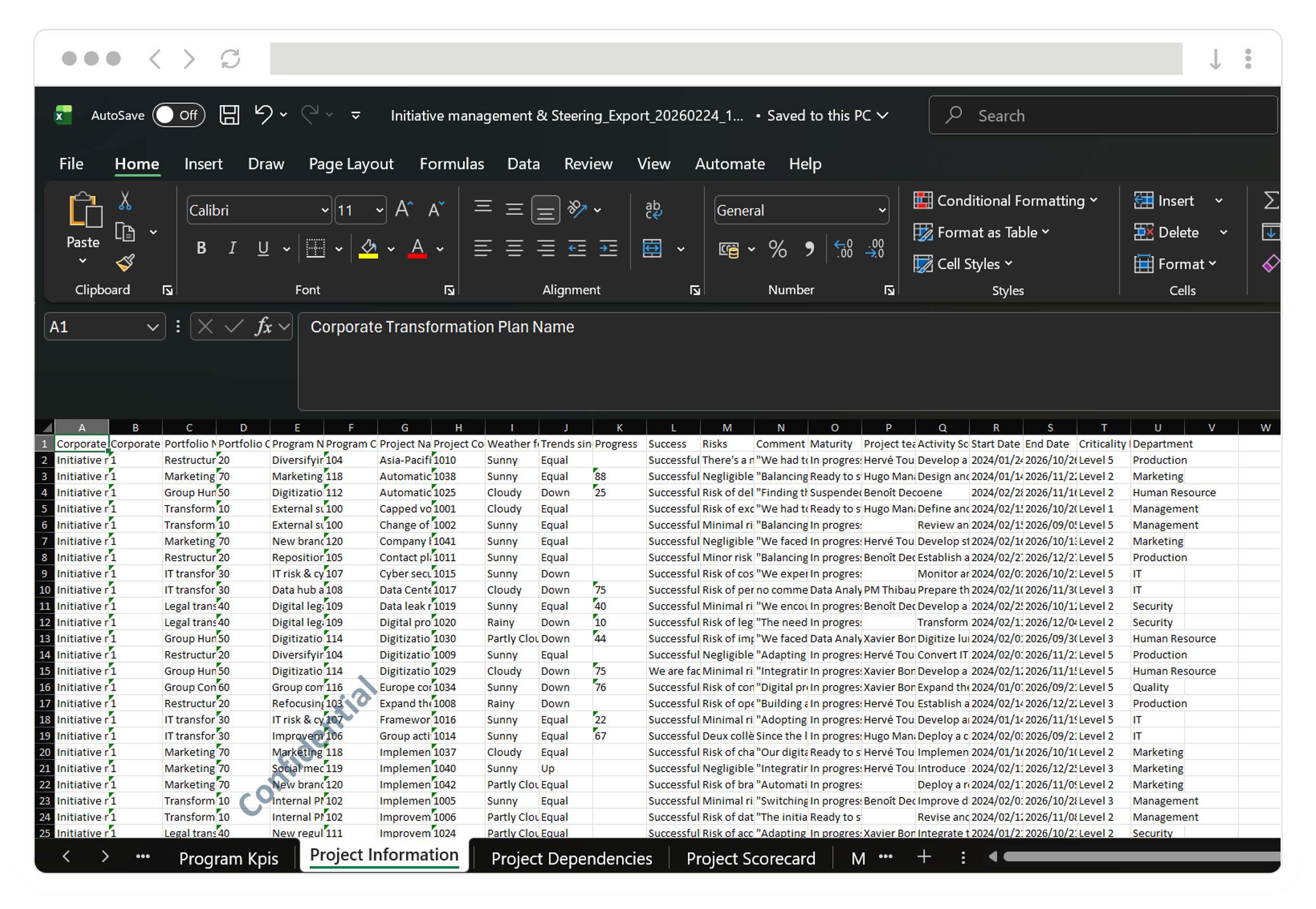
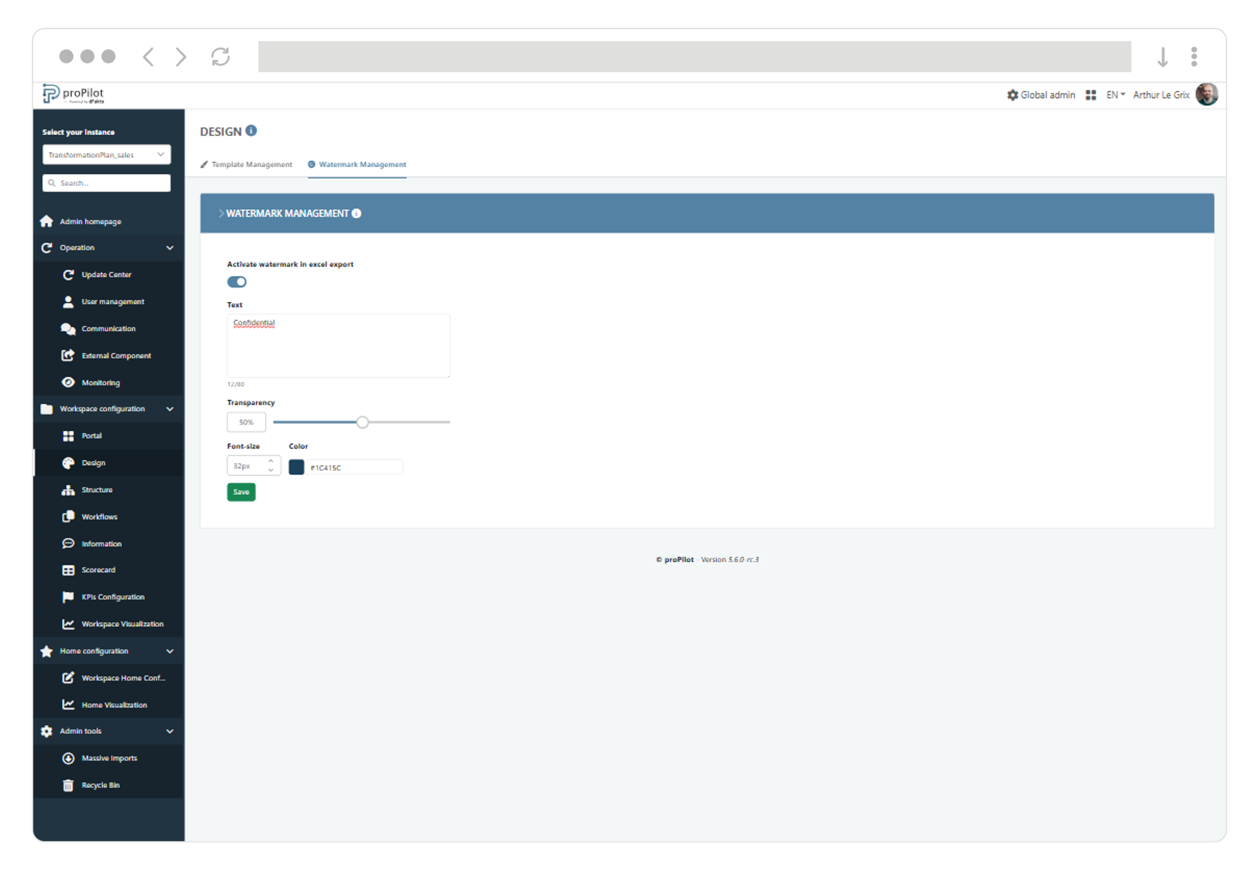
Secure and sign your data exports with a watermark
The watermark lets administrators automatically add background text to any Excel export generated by users from proPilot, strengthening visual identity and the confidentiality of shared documents.
-
Standardize your exports with a visible mention (e.g., Confidential, Internal, organization name) with no manual action.
-
Secure sharing by making the origin and confidentiality level immediately identifiable, even outside proPilot.
-
Cover your full scope: the watermark applies to visualization exports and to mass import/update templates (pre-filled files).
Things are moving fast… many improvements are delivered with every release!
The user interface is now more consistent and user-friendly
-
The update-period banner displays again its information message, guiding owners on the expected actions.
-
The “In progress” status for Excel exports is once again displayed with a dedicated progress color, avoiding any ambiguity.
-
The date selector on chart visualizations has been improved, enabling reliable period selection.
-
Instance design template colors are once again correctly applied to the left navigation, ensuring visual consistency.
-
KPI severity labels (status/priority) once again follow the standard color code (grey/green/orange/red) for immediate readability.
Update email management has been strengthened
-
The consistency between update email templates and the emails actually received by users has been improved, enabling reliable validation before sending.
Admin visualization configuration is now more reliable
-
Configuring an information table now always requires selecting a workspace before saving, ensuring a complete and consistent setup.
-
In information table configuration, when changing workspace and/or level, the column selection is now correctly synchronized with the new context.
-
In information table configuration, validation that the “Name” column is present is now correctly applied across consecutive saves, including after an initial save.
-
In information table configuration, the “Default sort column” field now offers the expected options based on configured columns.
-
In information table configuration, the 10-column limit is now reliably enforced after changes, allowing the configuration to be saved once adjusted.
-
The chart configuration flow now remains usable after an initial validation failure, allowing users to correct and continue.
-
Selection list headers in chart configuration are now clearer and better differentiated, making selection easier to understand.