
Introduction
Thanks to the interactive graphs, you can visualize the evolution of the indicators collected on the entity, as well as the progression of the aggregated indicators collected in child entities.
proPilot offers a broad range of graphic formats suitable to any use case of quantitative follow-up.
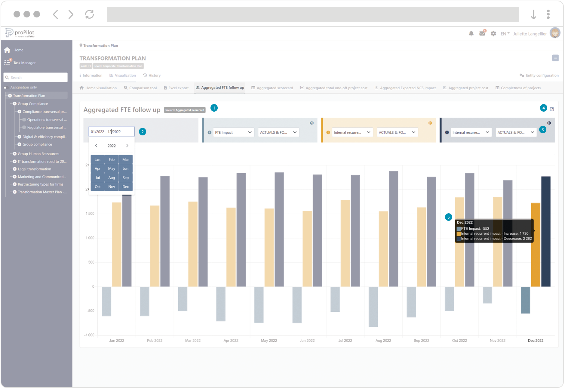
Horizontal and vertical Bar Chart
Bar Charts display the evolution of one or more indicators of the scorecard across time. Depending on the charts, it may be displaying the indicators collected on the current entity, or the indicators in the aggregated scorecard.
-
The source of the indicators displayed in the chart is referenced by a specific tag : “scorecard” (indicators are collected on the entity) or “aggregated scorecard” (aggregated indicators collected at lower levels of the structure).
-
Use the date range to filter the display on a specific period.
-
Edit the filters to select up to three quantities to display in the chart. A quantity corresponds to an indicator associated with a type of data (e.g.: actuals, target, etc.). You can hide a filter from the chart by clicking on the dedicated icon.
-
Click on the icon on the top-right corner to display the graph in an overlay box.
-
Hover over the bars with the mouse pointer to display the numerical values associated with each quantity.
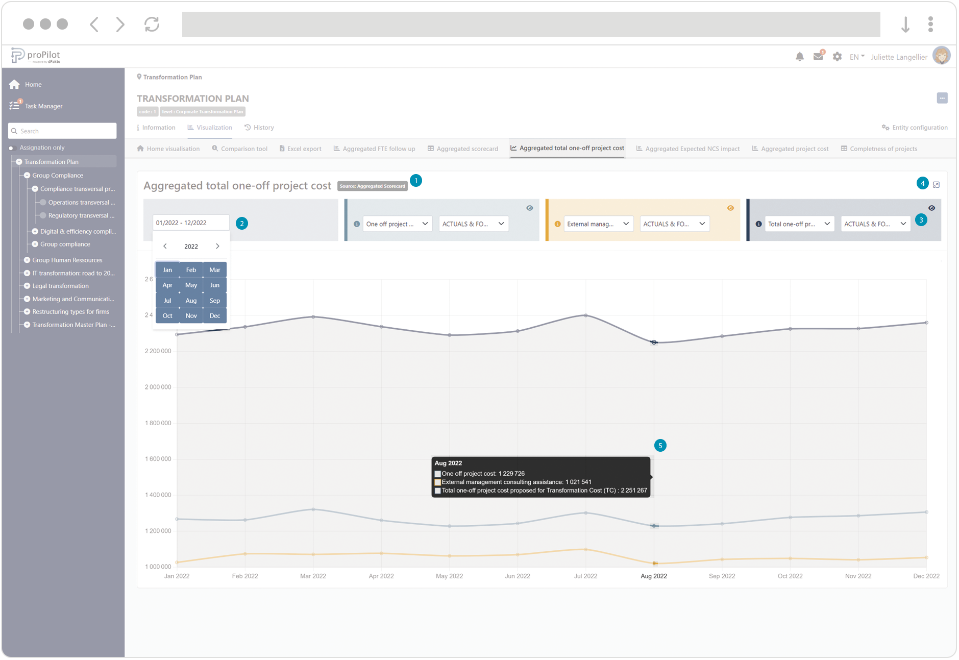
Line Chart
Line Charts display the evolution of one or more indicators of the scorecard across time. Depending on the charts, it may be displaying the indicators collected on the current entity, or the indicators in the aggregated scorecard.
-
The source of the indicators displayed in the chart is referenced by a specific tag : “scorecard” (indicators are collected on the entity) or “aggregated scorecard” (aggregated indicators collected at lower levels of the structure).
-
Use the date range to filter the display on a specific period.
-
Edit the filters to select up to three quantities to display in the chart. A quantity corresponds to an indicator associated with a type of data (e.g.: actuals, target, etc.). You can hide a filter from the chart by clicking on the dedicated icon.
-
Click on the icon on the top-right corner to display the graph in an overlay box.
-
Hover over the lines with the mouse pointer to display the numerical values associated with each quantity.
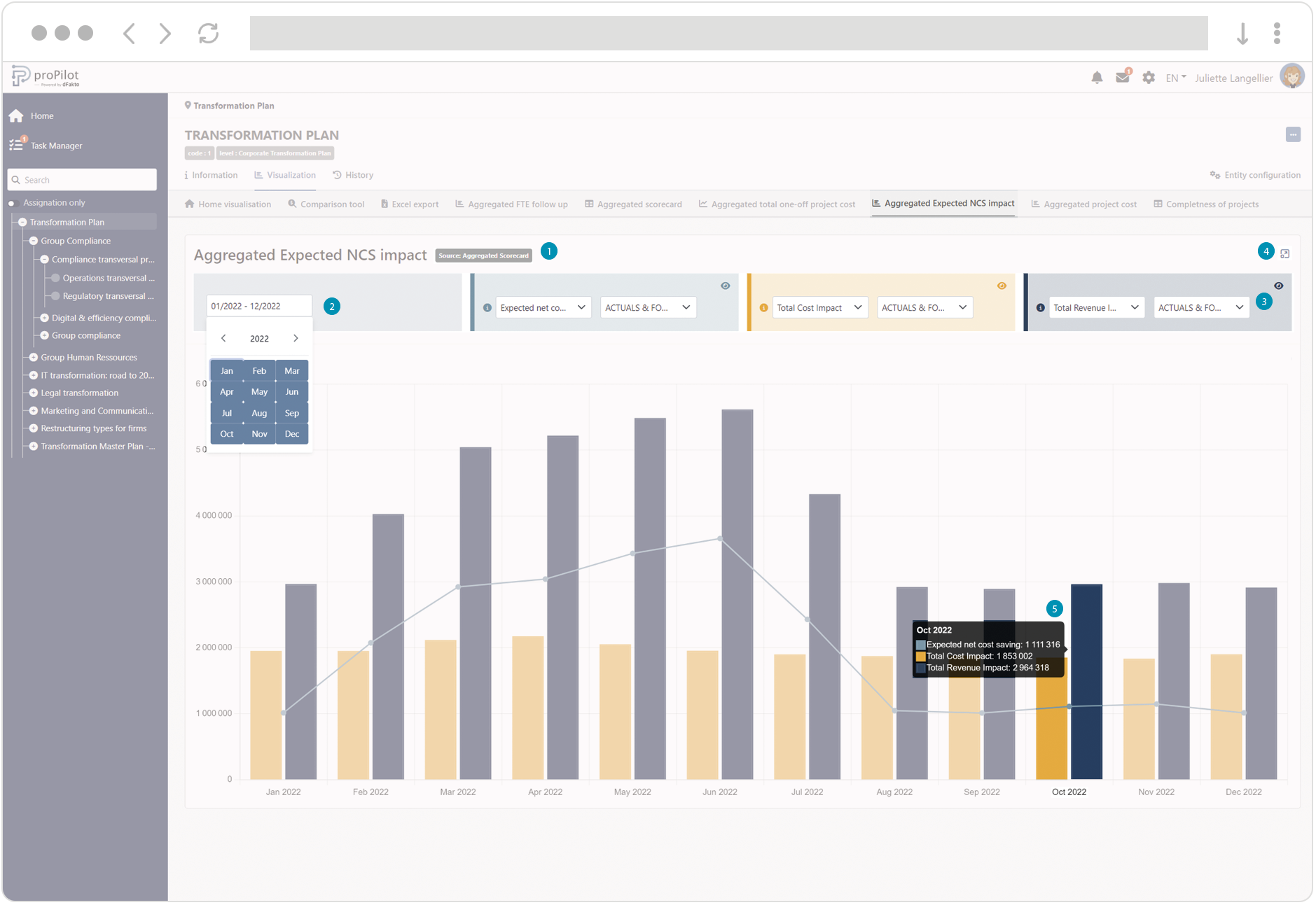
Combo Chart
Combo charts display the evolution of one or more indicators of the scorecard across time. The chart displays indicators as bars and lines. Depending on the charts, it may be displaying the indicators collected on the current entity, or the indicators in the aggregated scorecard.
-
The source of the indicators displayed in the chart is referenced by a specific tag : “scorecard” (indicators are collected on the entity) or “aggregated scorecard” (aggregated indicators collected at lower levels of the structure).
-
Use the date range to filter the display on a specific period.
-
Edit the filters to select up to three quantities to display in the chart. A quantity corresponds to an indicator associated with a type of data (e.g.: actuals, target, etc.). You can hide a filter from the chart by clicking on the dedicated icon.
-
Click on the icon on the top-right corner to display the graph in an overlay box.
-
Hover over the bars and lines with the mouse pointer to display the numerical values associated with each quantity.
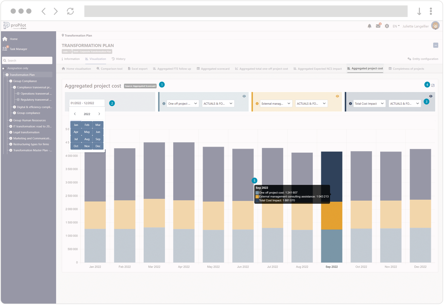
Stacked Bar Chart
Stacked bar charts display the evolution of one or more indicators of the scorecard across time. The chart displays indicators as stacked bars. Depending on the charts, it may be displaying the indicators collected on the current entity, or the indicators in the aggregated scorecard.
-
The source of the indicators displayed in the chart is referenced by a specific tag : “scorecard” (indicators are collected on the entity) or “aggregated scorecard” (aggregated indicators collected at lower levels of the structure).
-
Use the date range to filter the display on a specific period.
-
Edit the filters to select up to three quantities to display in the chart. A quantity corresponds to an indicator associated with a type of data (e.g.: actuals, target, etc.). You can hide a filter from the chart by clicking on the dedicated icon.
-
Click on the icon on the top-right corner to display the graph in an overlay box.
-
Hover over the stacked bars with the mouse pointer to display the numerical values associated with each quantity.
Export the Values from Your Chart
For each chart type, you can download a structured export of the displayed data. The export will dynamically adapt to the filters and settings applied to your visualization, accurately reflecting the displayed scope.
-
Click on the download icon.
-
Download the file from your browser to your device.
