Introduction
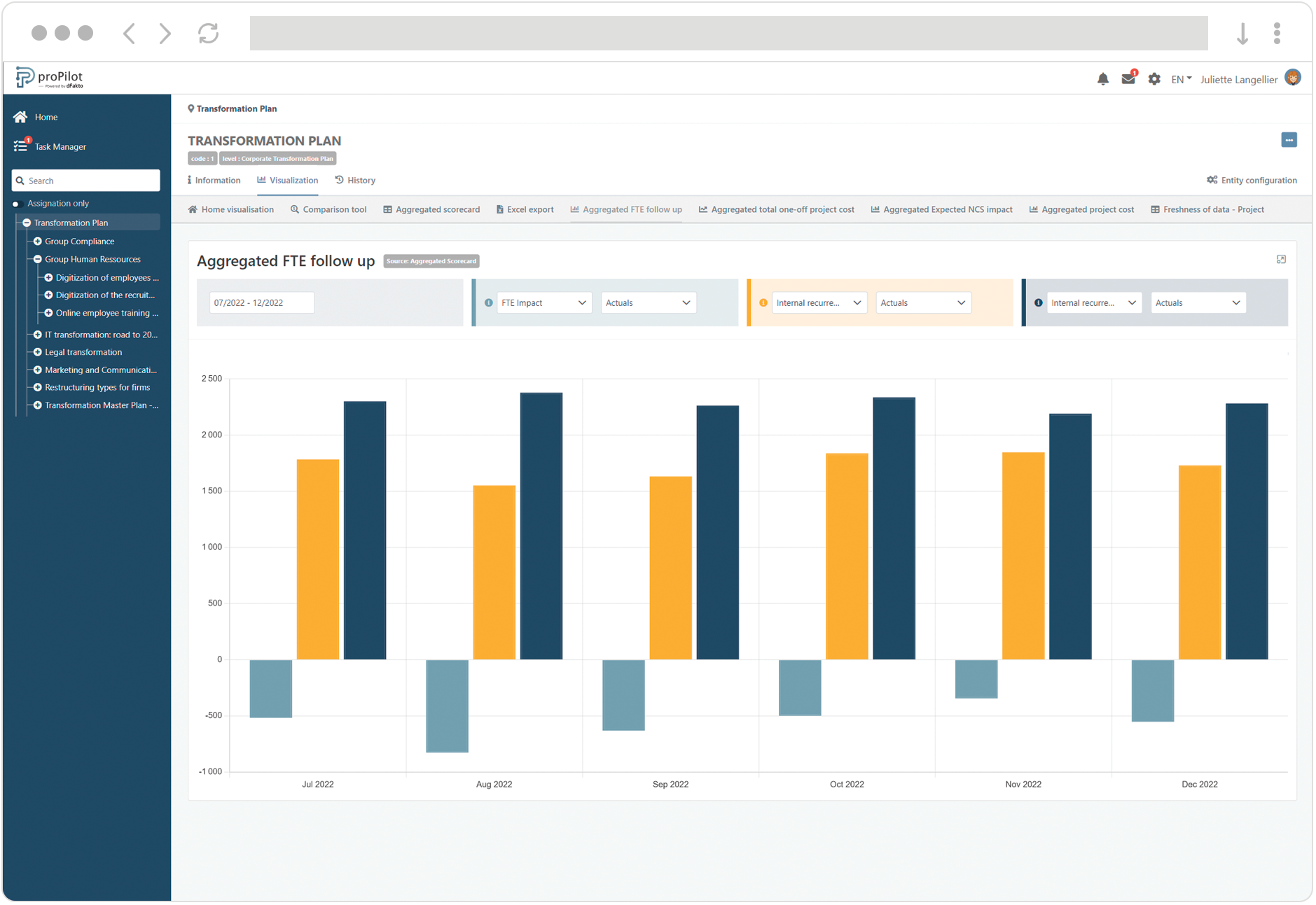
This visualization allows to graphically display the indicators collected in the scorecard. You can select the data source to display either the scorecard of the entity or the aggregated values of the indicators, if the current entity is located at a superior level in the structure.
Multiple bars have the same function as simple bars. The various indicators are spaced from each other and form groups. Colors associated to each bar allow easy cross-indicator comparison. Bear in mind that the legibility of the graph decreases as the number of bars increases. Consider opting for another type of graphic representation if you need to display more than 3 indicators.
Create a Multiple Bar Chart
-
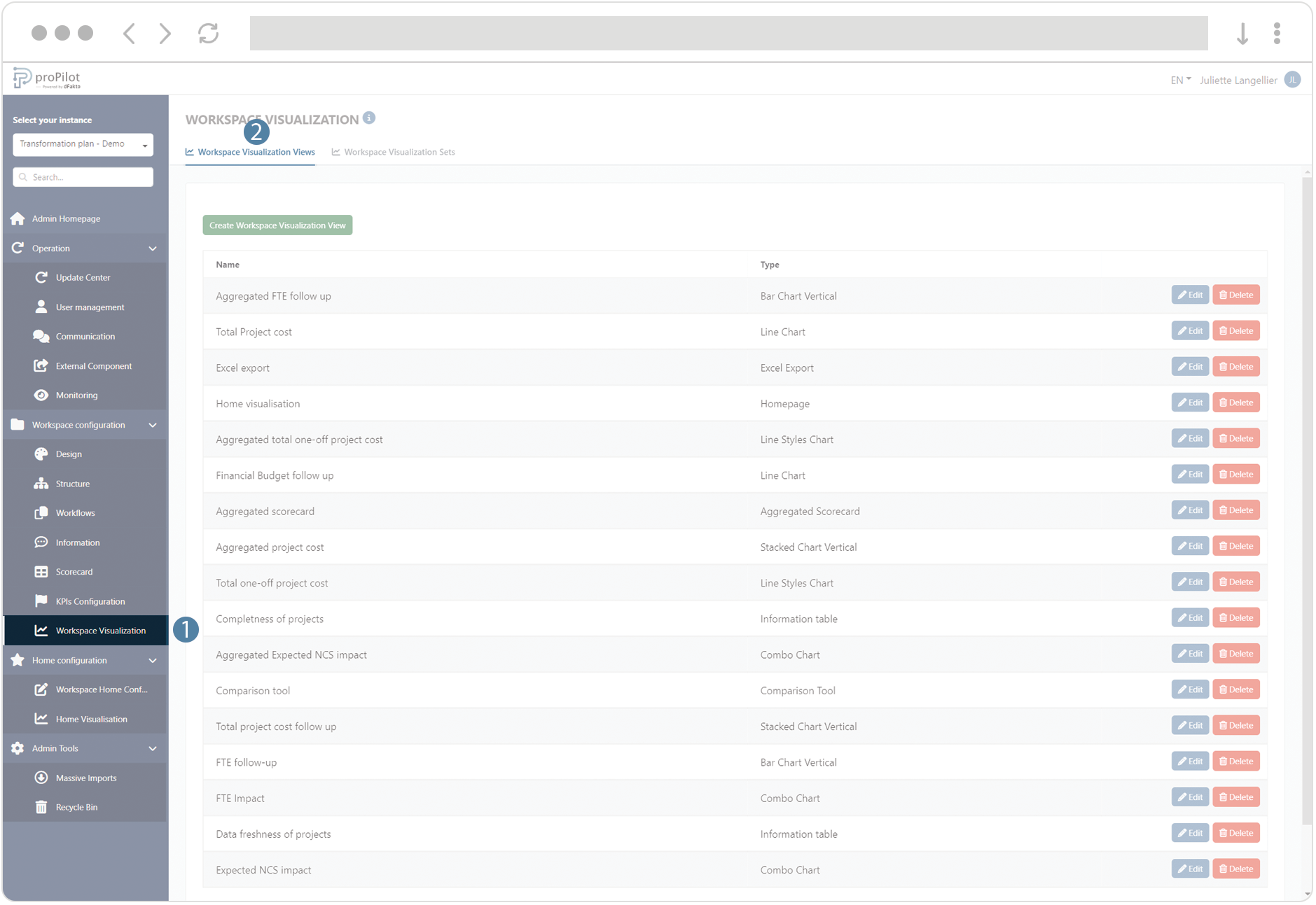
In the left menu, select "workspace configuration" and then "workspace visualization".
-
Then click on the "workspace visualization views" tab.
-
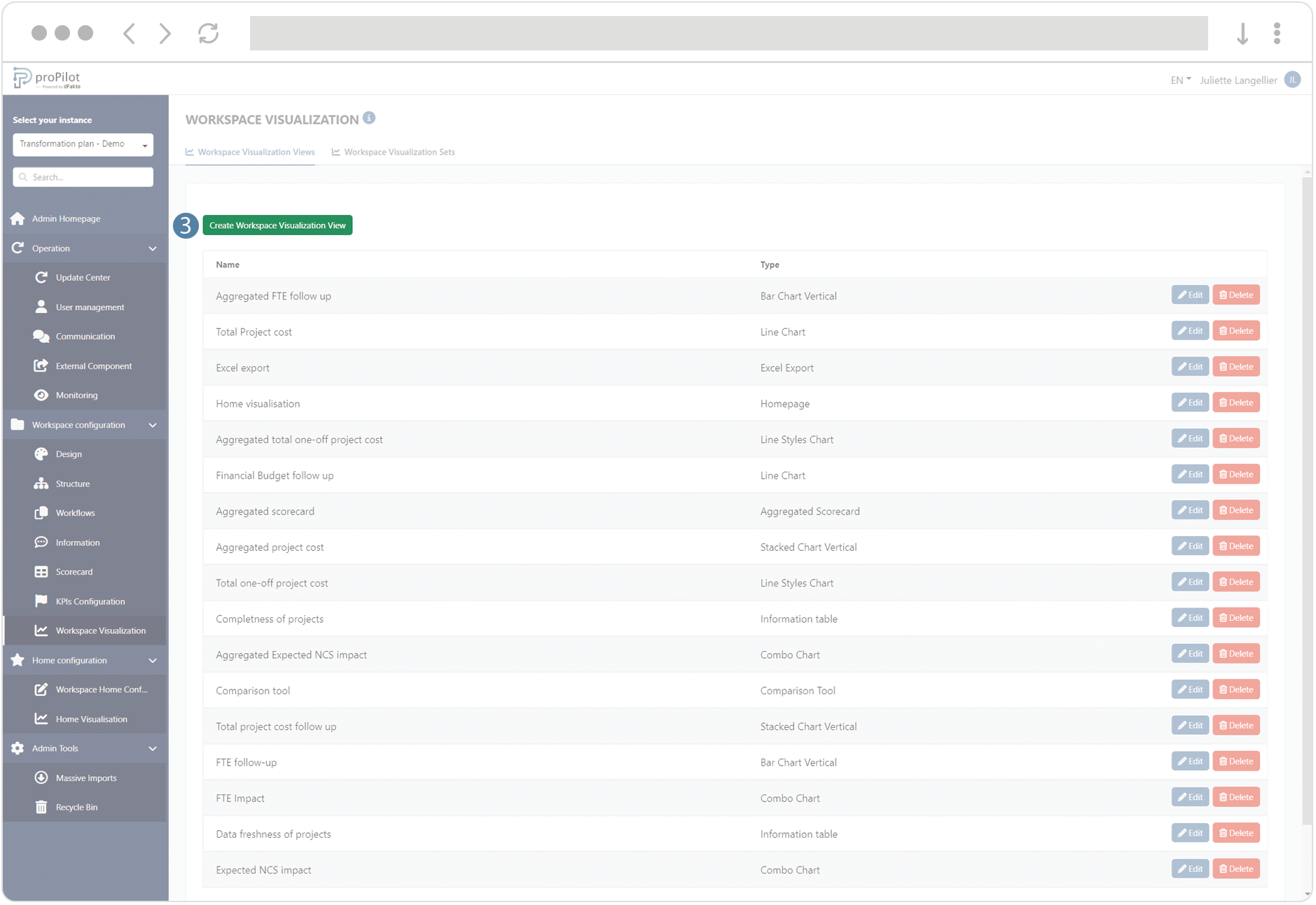
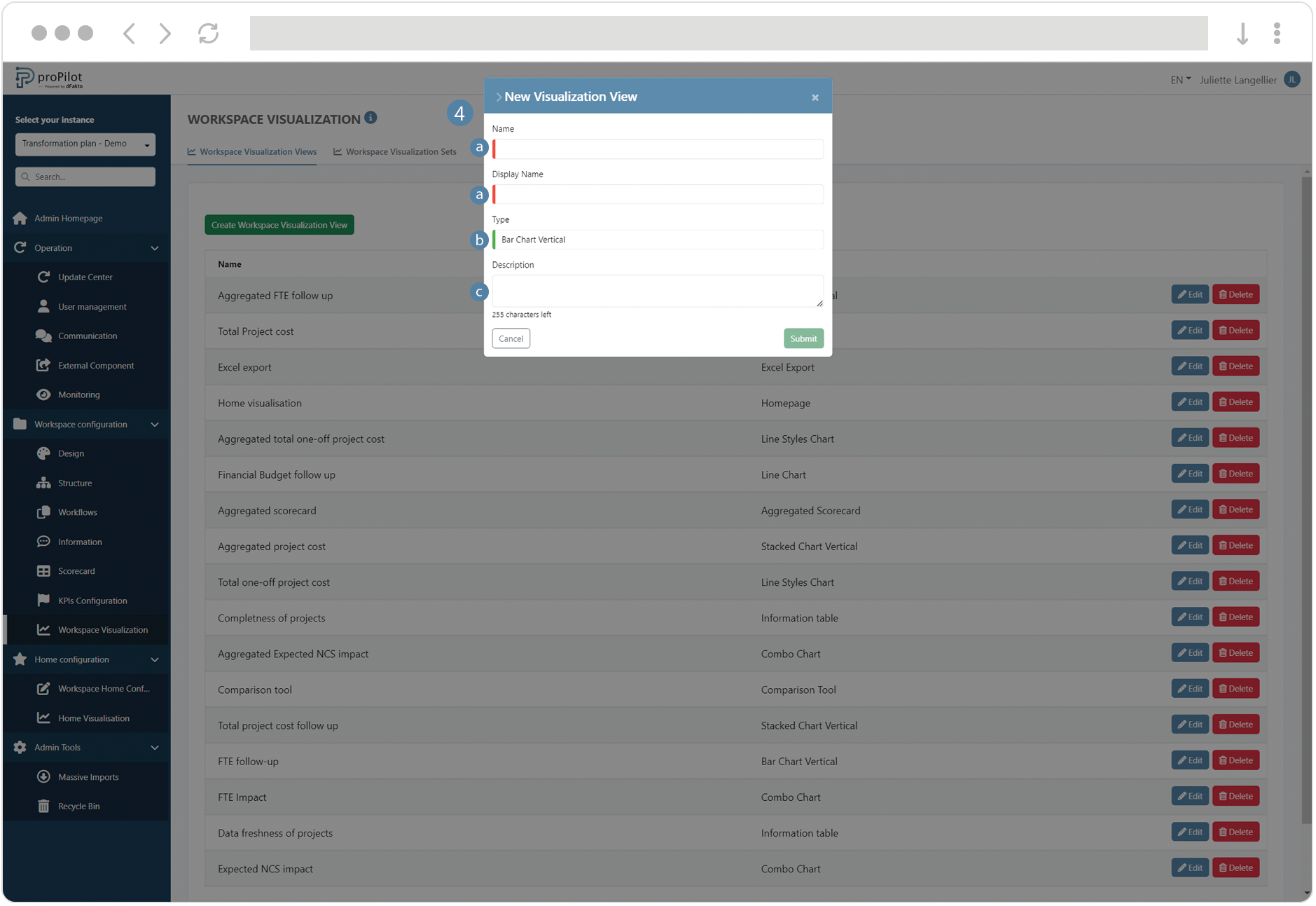
Click on the "create workspace visualization view" button. A pop-up window will open.
-
Fill the following fields :
-
(technical name) and display name
-
Choose the type of visualization "Bar Chart Vertical" or "Bar Chart Horizontal"
-
Add a description if necessary
-
-
-
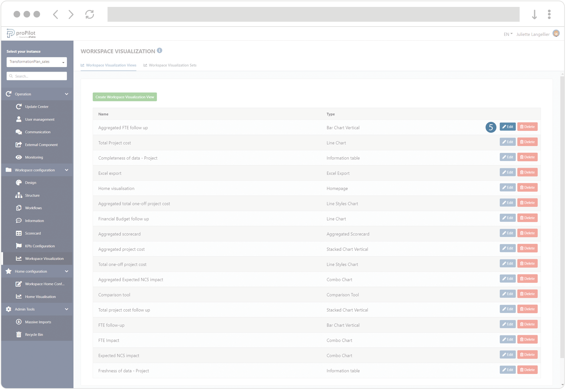
Save the visualization view, then click on the “Edit” button.
-
Configure the graph :
-
Select the number of options available in the filter (between 1 and 3).
-
Choose the data source:
-
"Basic": Indicators collected at the entity level.
-
"Aggregation": Indicators consolidated from values collected at the lowest level.
-
-
Decide whether to display the cumulative indicator values or the collected values.
-
For each filter, add the available indicators and data types (e.g., "actuals," target, etc.) available to the user.

-
-
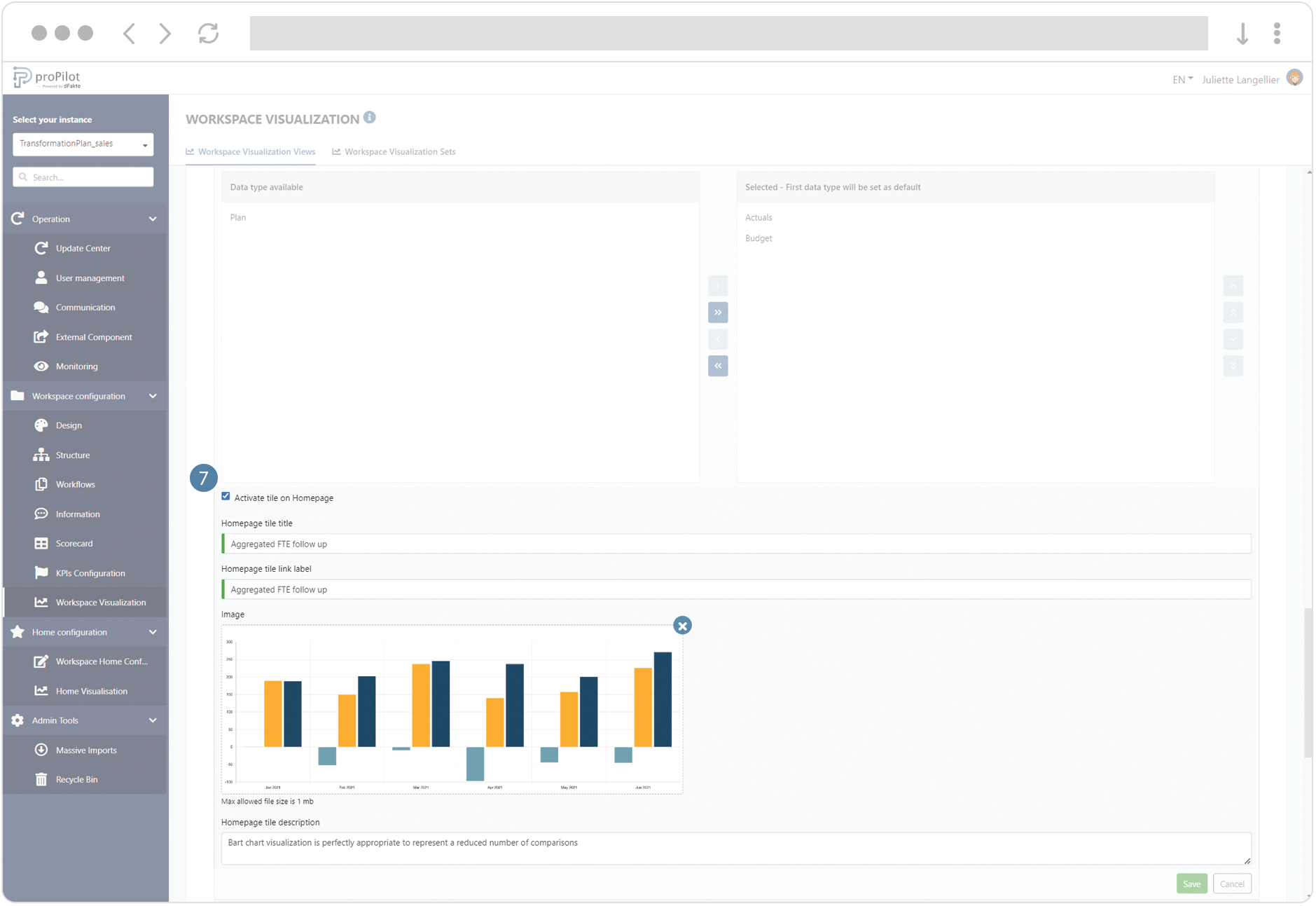
You can activate the tile in the visualization homepage of the entity and configure its title, description, label link and illustration image.