Introduction
This visualization allows to graphically display the indicators collected in the scorecard. You can select the data source to display either the scorecard of the entity or the aggregated values of the indicators, if the current entity is located at a superior level in the structure.
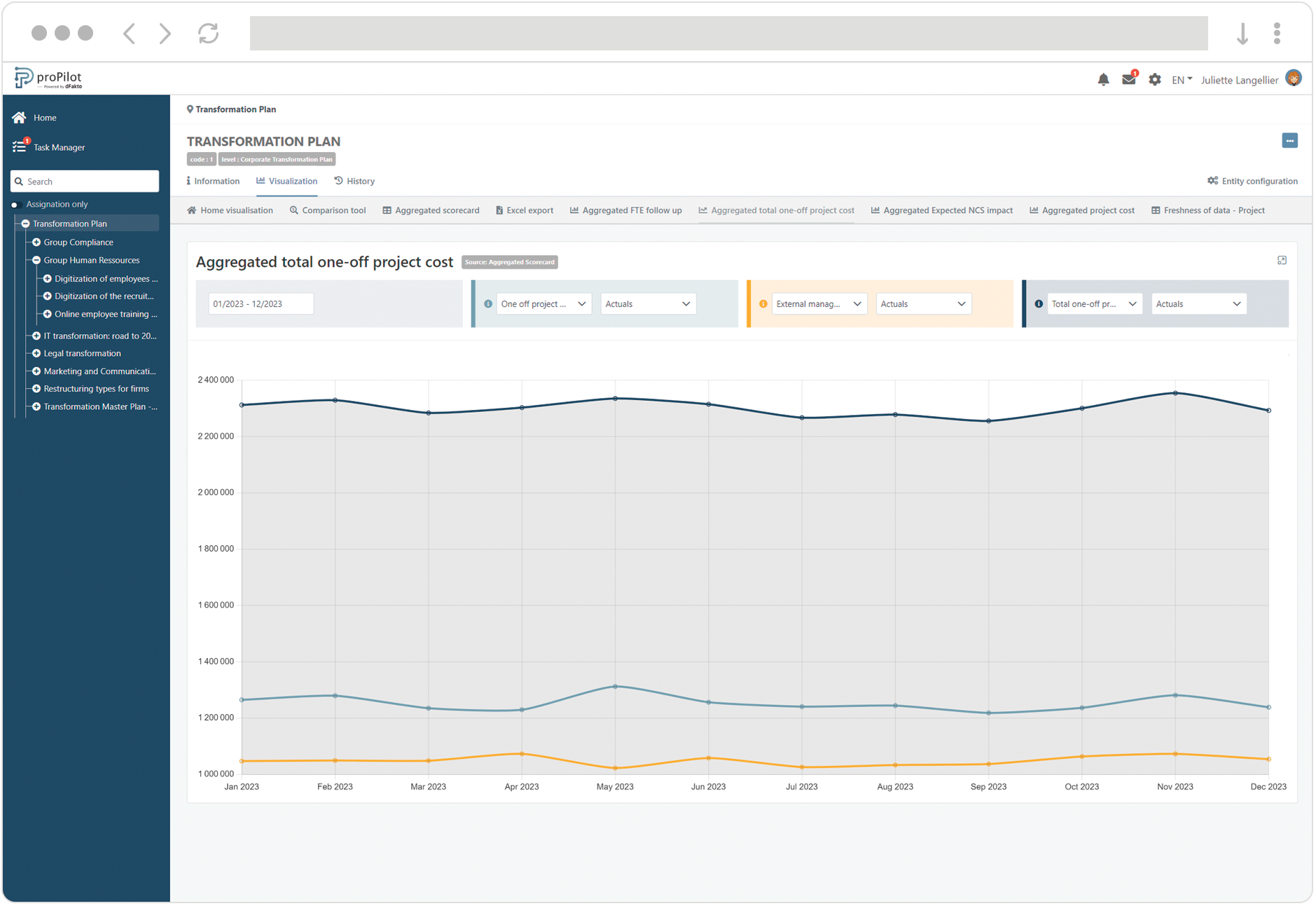
The lines represent the variations of the values across time. Several lines can be displayed to compare indicators between them or compare them with forecasts.
Create a Line Chart
-
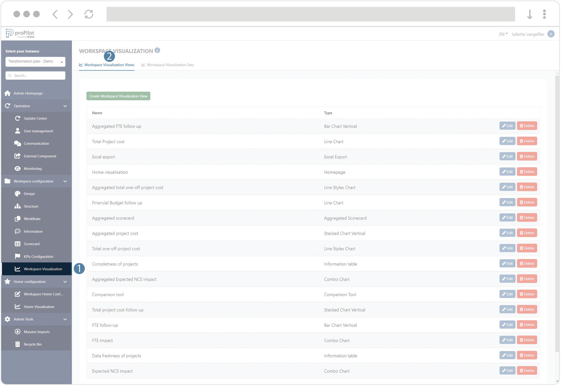
In the left menu, select "workspace configuration" and then "workspace visualization".
-
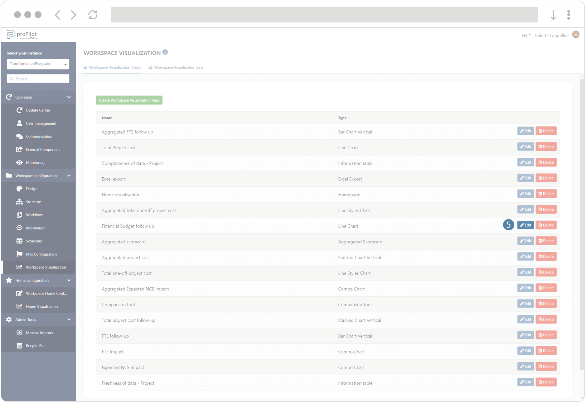
Then click on the "workspace visualization views" tab.
-
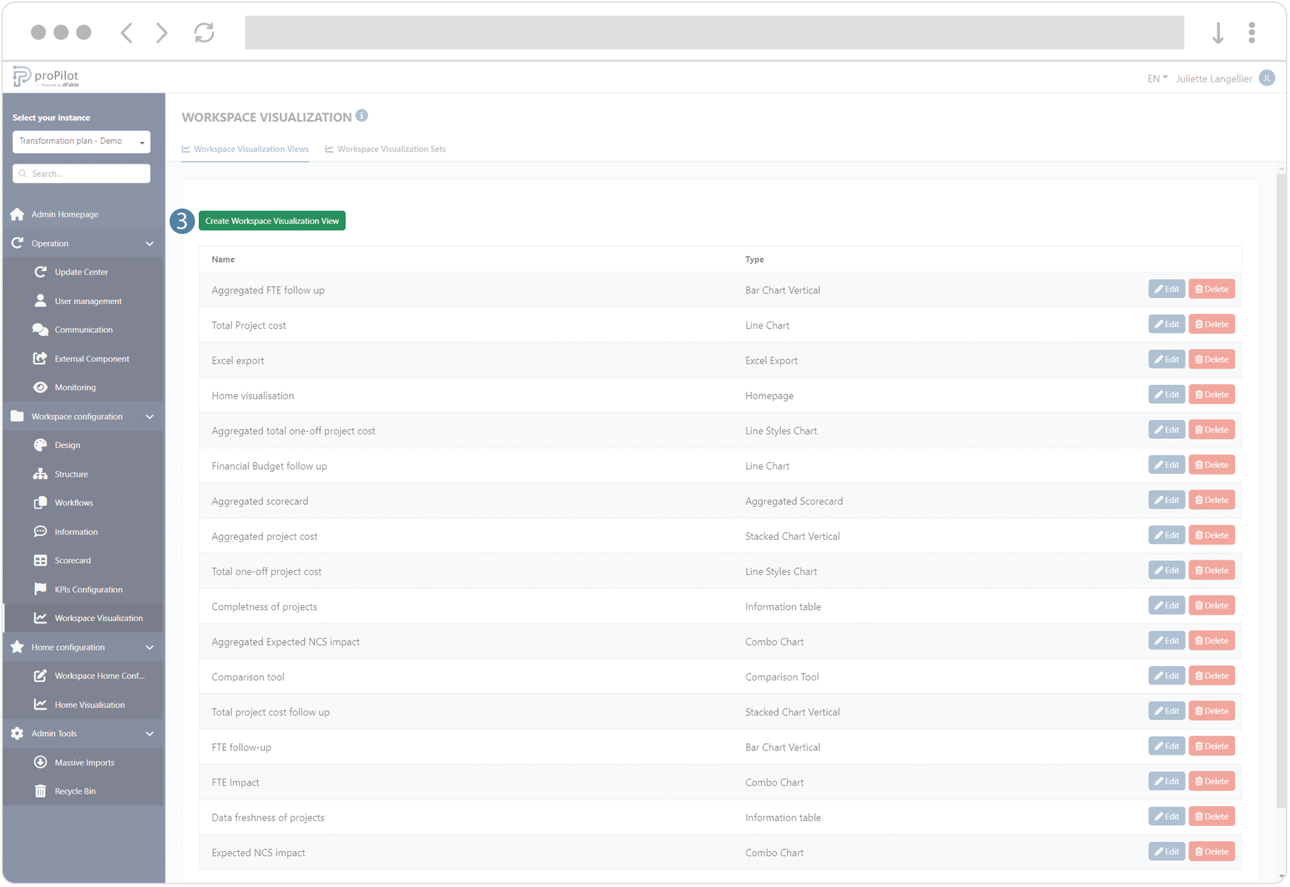
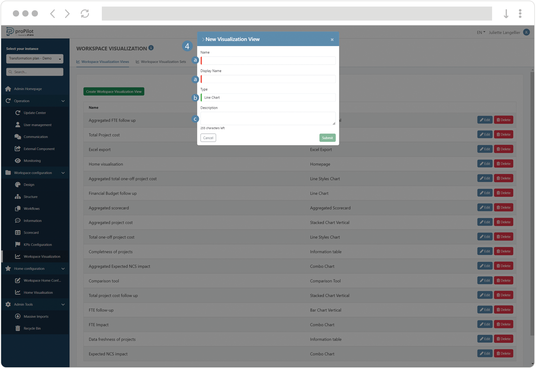
Click on the "create workspace visualization view" button. A pop-up window will open.
-
Fill the following fields :
-
(technical name) and display name
-
Choose the type of visualization "Line Chart" or "Line Styles Chart”
-
Add a description if necessary
-
-
Save the visualization view, then click on the “Edit” button.
-
Configure the graph :
-
Select the number of options available in the filter (between 1 and 3).
-
Choose the data source:
-
"Basic": Indicators collected at the entity level.
-
"Aggregation": Indicators consolidated from values collected at the lowest level.
-
-
Decide whether to display the cumulative indicator values or the collected values.
-
For each filter, add the available indicators and data types (e.g., "actuals," target, etc.) available to the user.

-
For the “Line Charts”, the filters will be displayed as lines with different colors
-
For the “Line Styles Charts”, the filters will be displayed as lines with different colors, the first line being a simple line, the second a dotted line and the third a filled-area line.
-
-
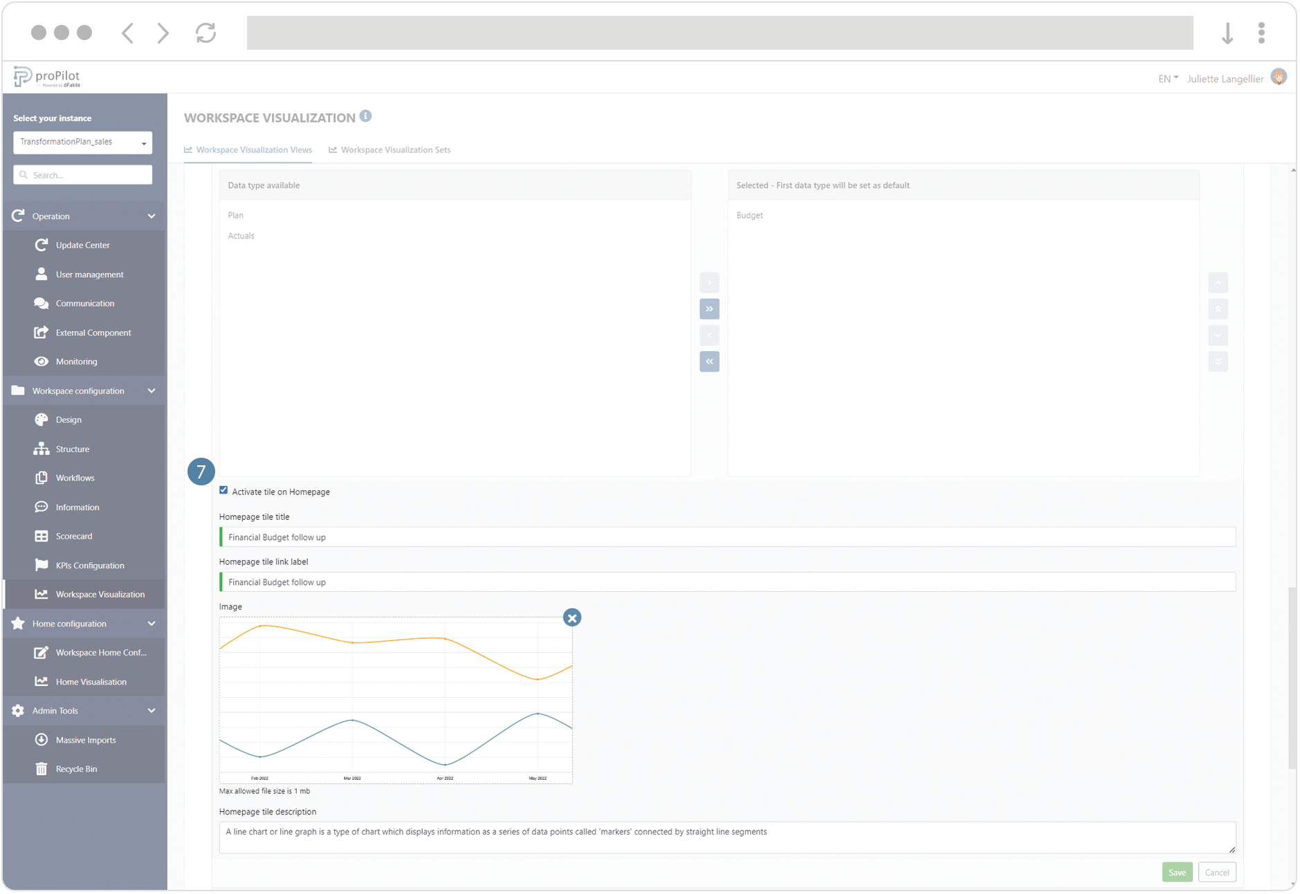
You can activate the tile in the visualization homepage of the entity and configure its title, description, label link and illustration image.